


Every season, we choose a few select colors to introduce into the TOM BIHN lineup.
And say no to plenty more.
If you've been around for a while, you know how much our community loves color. We are not ones to shy away from bold hues in any aspect of our lives. Picking colors is one of the most exciting–and most challenging–decisions we must make each year. It comes down to testing dozens of swatches, comparing them in different lighting, against every zipper, fabric, and trim we use. These swatches live in our back pockets until we’ve reached our final, colorful decisions.
We don't do ordinary--our bags have way too much personality for that. Each color in our 200 Halcyon and 210 Cerylon collections, as well as the majority of our 630 Ballistic colors, are entirely custom dipped to our exact preferences. Why? Because settling for stock colors is like showing up to a Halloween party in khakis and a name tag.
Choosing colors is never easy, and saying no is even harder. Some shades immediately stand out to us as yes, while others are maybe-next-times, a few absolutely nots, and a select few are no’s for now.
You’ve only seen the colors we say yes to. So here is a look at some of the colors we DIDN’T pick for summer—and why.
The Didn’t Pick Gallery
Almost Made It
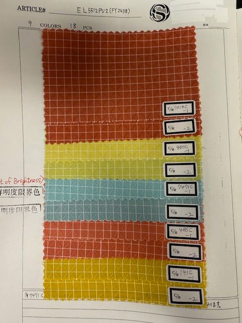
We loved these warm, desert-y inspired shades, but ultimately we felt they were too similar to other colors that we’ve introduced in the past, specifically Monarch, Wasabi, Seafoam, and Zest. The last sample also reminded us a little too much of baby food... and we lost our appetites.
Not This Season
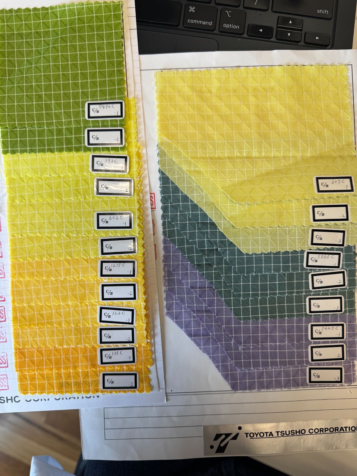
Some of these were great in theory. But great doesn’t always mean right now.
We love the idea of a butter-yellow shade, but these samples were just a bit off in what we are looking for. We even played with the ideas of a Dusk-inspired Halcyon, and even though the Pantone chip was promising, the samples didn’t hit quite the same as they do in Cerylon (in our opinion).
Maybe Later
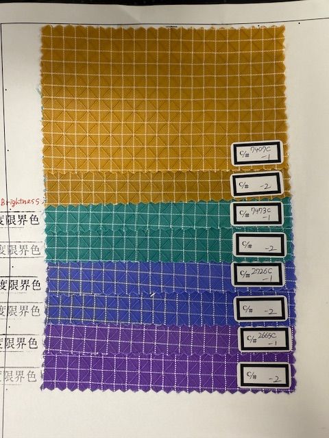
Let’s be honest: not every “no” is a forever no. Some of these colors have a kind of slow-burn charisma. They weren’t quite ready for summer, or summer wasn’t ready for them. There’s the mustard yellow that almost made the cut. An emerald green that hits like cool shade on a hot day. An interesting 'blurple' that seemed to shift tones every time you looked at it. A true purple that’s unapologetically bold in the best way. Maybe fall. Maybe next year. Maybe sooner than you think. You didn’t hear it from us.
Not right now…
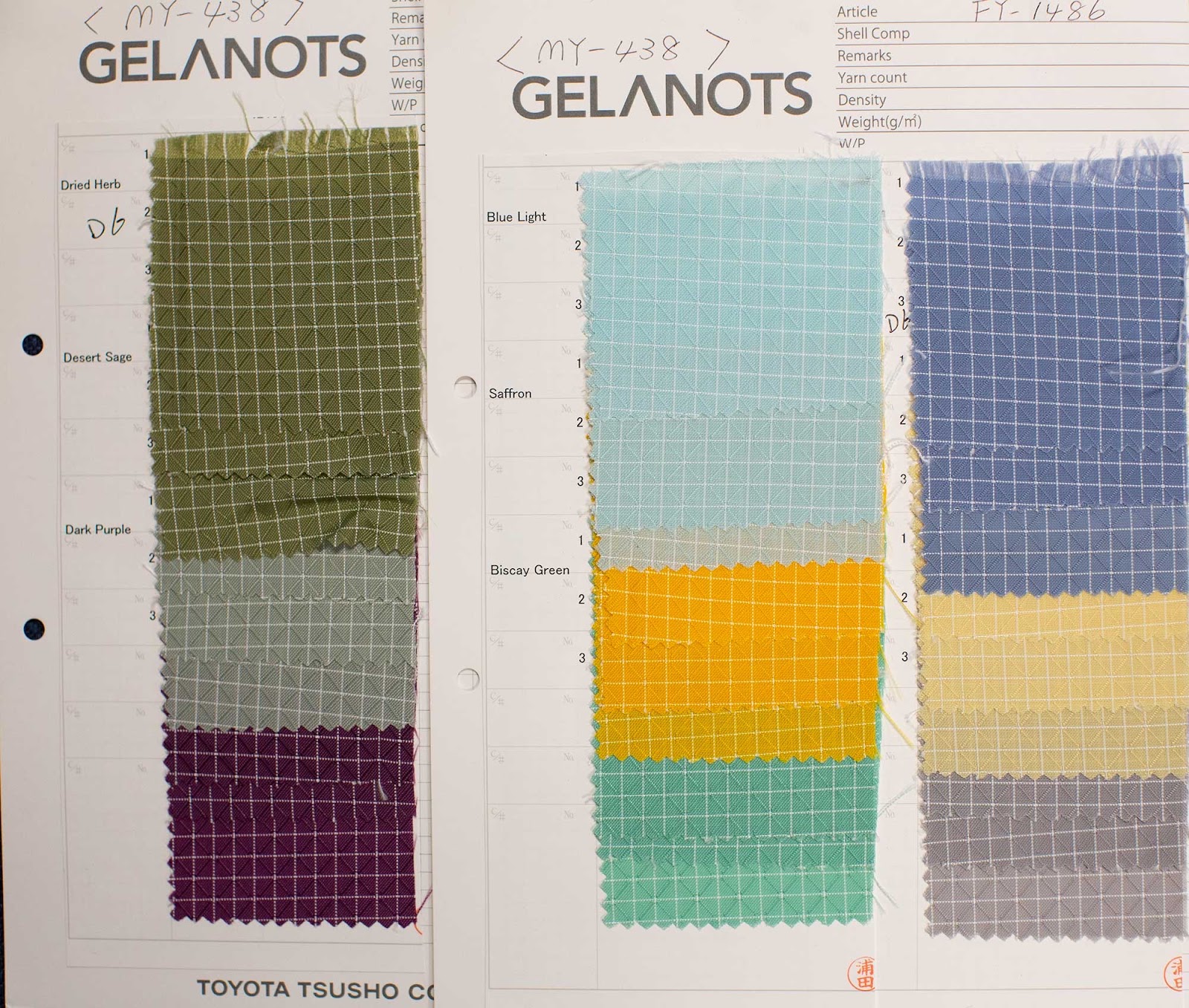
We were a fan of these neutral and pastel tones, but felt they already looked quite similar to some of our other past color options, including Taiga, Acai, Seafoam, Solaris, and Tidal. We love the idea of unique color stories, but the middle swatches side-by-side look like something you could find on the Miami Dolphins website, and this is the Emerald City–no offense to our Dolphins fans, of course. ;)
How We Choose The Colors We Do Pick
This part doesn’t change. There’s a method behind our final palette, and it’s more than just instinct.
-
We aim for balance: We try to select colors that fill gaps, not just for the sake of variety, but because we’re trying to build a palette that works together. If a swatch doesn’t bring something new to the wheel, it’s out. Even if we love it.
-
Bright liners are part of the function: Bright colors get chosen not because they’re fun (even though they are), but because they work. They light up the inside of your bag. You want to find your pen in the bottom of a Synik in a dark airport at 5 a.m.? You’ll thank Kiwi, or Cerise, or Zest.
-
We want every color to spark excitement: If it doesn’t make all of us enthusiastically say “yes!” it doesn’t make the cut.
-
We think about connection: We aim to offer colors that you folks feel connected to, as our favorite colors are often yours too. We’re always trying to listen to your dream colors and make that a reality.
What Comes Next?
You’ve seen the swatches. Some of them are staying on the bench.
Some of them? Let’s just say they’re already on the playing field.
We won’t spoil it—but if you’re the type to zoom in, analyze undertones, and line them up against old color drops, well… you’ll probably figure it out.
Let us know which ones stuck in your head in the comments below. We’re listening.
Omg the bold purple! I neeeeed it. 💜💜💜💜💜
I wish you would have more RED interior,
I really wabt the bright RED halcyon
And BRIGHT YELLOW interior
LOOOOVE the turquoise shades!! I don’t think they’re too close to Seafoam… (Seafoam was actually a smidge too minty-green for my liking, ymmv) I could also see doing a bright petrol blue. And the blurple is amazing though I would want it for accessories (stuff sacks) or exteriors (Bantam) more than interiors. Fingers crossed for some of these to make it through the process!!
Love that purple. Would instabuy. Hope to see it in a synapse soon.
All colors are beautiful. But, talking about trying to find things inside of bags when it is dark outside, while i absolutely love the idea of the blurple, I cannot see myself buying anything lined up with it. I can see it as fabric used for organizers to add interesting and new colors to what I have. I love Açaí and Moab, but I have had to return anything I’ve bought that’s lined up with them, precisely because they are dark. I love that Olive you have up there, but I’m having the same issue. I do hope we have something different from yellow. As bright as it is, it is challenging to pair with other TB colors in a way that doesn’t resemble school or team colors. We do need more teal colors. Seafoam was used recently, but turquoise has not been used for a long, long time. And it is different from the greenish teals. In any case, I am sure I will enjoy any color that you have chosen.

